The Role of Homepage Design in Conversions
Homepage design drives conversions through message clarity, one dominant CTA, and social proof placed above the fold. Here is what actually moves the numbers.

Your homepage is your storefront, your handshake, and your first pitch all at once. The role of homepage design in conversions is to create a focused experience that persuades visitors to act with minimal friction. Research on 500 B2B SaaS homepages found that hero sections with outcome statements outperform generic positioning by 38%, and simplifying homepage content increased trial signups by 84%. Those numbers are not accidents. They reflect a core truth: conversion rate optimization (CRO) on your homepage is a messaging and structure problem first, and a visual design problem second.
What is the role of homepage design in conversions?
Homepage design shapes whether a visitor stays or leaves. Visitors decide within 15 seconds whether your site is worth their time, and bounce rates between 40% and 60% are common when clarity is missing. That window is brutally short. Every design decision you make either earns those seconds or wastes them.
The industry term for this discipline is conversion rate optimization, or CRO. It covers everything from headline copy and button placement to page speed and social proof positioning. When designers and marketers treat the homepage as a messaging system rather than a digital brochure, conversion rates climb. When they treat it as a canvas for visual trends, results stall.
SEO expert Marcus Miller describes the homepage as the crucial "front door" that must be architected clearly for both human visitors and AI agents to interpret site purpose. That framing matters. Your homepage does not just convert people. It communicates what you do, who you serve, and why they should care, all within the first scroll.
Which homepage design elements most influence conversions?
The highest-impact elements are the hero section, the primary call to action (CTA), social proof, and navigation labels. Each one either moves visitors forward or creates friction that sends them away.

Hero section messaging
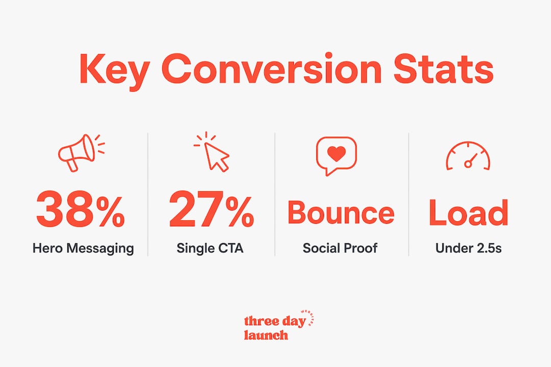
Your hero section carries the heaviest conversion weight. Outcome-focused hero messaging beats generic positioning by 38% because it answers the visitor's first question: "What will this do for me?" The best-performing hero sections follow a clear sequence: state the outcome first, identify the audience second, and place the CTA last. Flipping that order reduces demo conversion rates measurably.
Call to action clarity
One clear, dominant CTA above the fold increases click-through rates by 27% compared to pages with multiple equal-weight CTAs. This is Hick's Law in practice. More choices create more hesitation. Pick one action you want visitors to take on the homepage and make everything else secondary.
Social proof placement
Social proof above the fold reduces bounce rates by reassuring visitors before they have committed their attention. Most sites bury testimonials and client logos halfway down the page. That placement fails new visitors who need trust signals early, not after they have already decided to leave.
Navigation language
Replacing organizational jargon with buyer search terms in navigation labels reduces cognitive load and improves visitor flow. If your nav says "Solutions" when your visitors are searching for "pricing" or "how it works," you are creating confusion where there should be clarity.
Pro Tip: Run your navigation labels past someone outside your industry. If they cannot predict what they will find behind each label, rewrite it in plain language.
How does simplifying homepage content boost conversion rates?
Plausible Analytics reorganized their homepage content and cut excessive text. The result was an 84% increase in trial signups. That is not a minor lift. It shows that removing friction from your homepage is often more powerful than adding new features or design elements.
Visitors scan, they do not read. Above-the-fold content receives 84% more attention than content below the fold. That means your most important message, your clearest benefit, and your primary CTA all need to live in that top section. Anything that does not earn its place there should move down or disappear entirely.
Here is a content flow that consistently outperforms cluttered alternatives:
- Hero section: State the outcome your visitor gets. Be specific. "Get more coaching clients" beats "Welcome to our platform."
- Key features or services: Show the two or three things you do best. Keep descriptions short and benefit-focused.
- Social proof: Testimonials, client logos, or case study results. Place these before the visitor has to scroll far.
- Pricing or next action: Give visitors a clear path forward. Ambiguity here kills conversions.
- Secondary CTA: Catch visitors who scrolled past the first one without acting.
Cutting copy is harder than writing it. Every sentence on your homepage should answer a question your visitor is actually asking. If it does not, cut it.
Pro Tip: Test your CTA button text with specific language tied to the action. "Start free trial" consistently outperforms "Get started" because it tells visitors exactly what happens next.
How does personalization affect homepage conversion rates?
Personalized product or content feeds generate 3.2x more revenue per session than static homepages showing the same content to every visitor. That gap is widening as visitor expectations rise. A homepage that shows the same hero image to a first-time visitor and a returning customer is leaving revenue on the table.
Modern homepage patterns are shifting toward what designers call "discovery engine" layouts, inspired by platforms like TikTok. These layouts prioritize content based on user behavior and time of day rather than a fixed editorial hierarchy. For ecommerce and content-heavy sites, this approach drives measurable engagement gains.
Mobile-specific homepage features deserve separate attention. Bottom navigation bars, sticky CTAs, and compressed hero sections improve mobile conversion rates. Touch target sizes, lazy loading images, and reduced text blocks all contribute to a faster, more usable experience on smaller screens. Custom bio pages follow similar principles, using personalized content hierarchy to drive profile engagement and signups in professional services contexts.
The table below shows how different personalization approaches compare across key factors:
| Approach | Best for | Complexity | Conversion impact |
|---|---|---|---|
| Static homepage | Small sites, early stage | Low | Baseline |
| Segmented hero messaging | B2B, coaching, services | Medium | Moderate lift |
| Personalized product feeds | Ecommerce | High | Up to 3.2x revenue per session |
| AI-driven discovery layout | Content platforms | Very high | High, requires ongoing data |
Let's Launch Your Strategic Coaching Website
Your first step is to book a free call so we can get your questions answered.
Book A Free CallBalancing personalization complexity with your site goals is the real skill here. Not every site needs an AI-driven feed. But every site benefits from knowing which visitor segment lands most often and writing the hero section for that person.
What common mistakes reduce homepage conversions?
The most damaging homepage mistakes are structural, not visual. You can have a beautiful site that converts poorly because the messaging is cluttered or the trust signals are buried.
- Multiple competing CTAs: When every section has its own button with equal visual weight, visitors freeze. Decision paralysis is real, and it costs you clicks. Pick one primary action and demote everything else visually.
- Jargon-heavy navigation: Internal team language confuses visitors who do not share your organizational vocabulary. Write navigation labels the way your customers search, not the way your org chart is structured.
- Slow load times: Moving from a 1-second to a 3-second load time raises bounce rate probability by 32%. Your homepage should load in under 2.5 seconds. Every extra second costs you visitors.
- Social proof below the fold: New visitors need reassurance before they commit attention. Logos, testimonials, and results belong in the top half of the page, not at the bottom.
- Featured products without context: Showing specific products or services before visitors understand what you do disengages them. Give visitors category context before you push them toward a specific offer.
Pro Tip: Audit your homepage monthly with a heatmap tool, session recordings, and a speed test. Heatmaps show where visitors click and stop scrolling. Session recordings reveal confusion in real time. Speed tests catch technical drag before it compounds.
Key Takeaways
Homepage design drives conversions through message clarity, structural hierarchy, and trust signal placement, not through visual trends or aesthetic choices alone.
| Point | Details |
|---|---|
| Hero messaging wins on outcomes | Outcome-focused hero sections outperform generic positioning by 38% in B2B SaaS studies. |
| One CTA beats many | A single primary CTA above the fold converts 27% better than multiple competing buttons. |
| Social proof belongs above the fold | Placing trust signals in the top half of the page reduces bounce rates for new visitors. |
| Simplicity lifts signups | Cutting excessive copy and reorganizing content flow can increase trial signups by 84%. |
| Speed is a conversion factor | A load time increase from 1 to 3 seconds raises bounce probability by 32%. |
What I've learned from watching homepages succeed and fail
Here is the uncomfortable truth about homepage CRO: most teams fight over homepage real estate instead of optimizing it. Marketing wants a banner. Sales wants a product demo. Leadership wants the mission statement front and center. The result is a homepage that serves everyone internally and no one externally.
Rahul Chaudhari's analysis of a costly Amazon homepage redesign makes this point sharply. Homepage optimization should focus on user adoption and long-term engagement, not just initial clicks. When internal politics drive homepage decisions, visitor focus collapses and conversions follow.
What actually works is treating the homepage as a living messaging system. The highest-performing homepage tests come from continuous, incremental changes to headline copy and CTA text, not from wholesale redesigns. A single headline clarity change produced a +21% conversion lift in one documented A/B test. That is the kind of result you get from testing one variable at a time, not from launching a brand new site every 18 months.
At Three Day Launch, we see this pattern constantly with coaches. The sites that convert best are not the most visually elaborate ones. They are the ones where the hero section speaks directly to one specific person, the CTA is impossible to miss, and the social proof shows up before the visitor has to scroll. Simple, clear, and structured. That is the formula. The coaching site conversion best practices we apply every time come back to those same three principles, regardless of niche or design style.
Stop treating your homepage as a finished product. Treat it as a hypothesis you test and refine with real visitor data.
How Three Day Launch builds homepages that convert
If you want a homepage that applies these principles from day one, Three Day Launch builds custom coaching websites in three days, not three months. Every site is built around clear message hierarchy, a single dominant CTA, and social proof placed where it actually gets seen.

Coaches in life, finance, and health have seen real results, including meaningful increases in leads and client inquiries from organic traffic shortly after launch. Three Day Launch does not use templates that force your message into someone else's structure. The design serves your messaging, not the other way around. If you are ready to see what a conversion-focused homepage looks like for your coaching practice, visit the Three Day Launch website to learn more.
FAQ
What is the role of homepage design in conversions?
Homepage design determines whether visitors stay, engage, and take action. Clear messaging, a single CTA, and well-placed social proof are the primary drivers of conversion rate improvement.
How much does hero section copy affect conversion rates?
Outcome-focused hero sections outperform generic positioning by 38% in studies of B2B SaaS homepages. Stating a specific result for a specific audience consistently beats broad, vague positioning.
Where should social proof appear on a homepage?
Social proof belongs above the fold, in the top half of the page. Placing it there reduces bounce rates by reassuring new visitors before they decide to leave.
How fast should a homepage load?
Your homepage should load in under 2.5 seconds. Extending load time from 1 second to 3 seconds raises bounce probability by 32%, which directly reduces conversions.
Does personalization really improve homepage conversion rates?
Personalized product or content feeds generate up to 3.2x more revenue per session compared to static homepages. Even basic segmentation of hero messaging by visitor type produces measurable conversion lifts.