The Role of Email Capture Web Design in Lead Generation
How form placement, offer quality, and instant follow-up turn website traffic into qualified email leads.

Email capture web design is the practice of building forms and interactive elements on a website to collect visitor email addresses for marketing and lead nurturing. It sits at the center of every serious lead generation strategy because your website traffic means nothing if visitors leave without a way for you to follow up. The role of email capture web design goes far beyond slapping a signup box on a page. Placement, offer quality, form length, and mobile behavior all determine whether a visitor hands over their email or bounces without a trace. Get these elements right, and your site becomes a lead generation machine that works around the clock.
What key elements make email capture forms effective?
Form design is where most websites quietly lose leads every single day. The good news is that the fixes are specific and measurable.
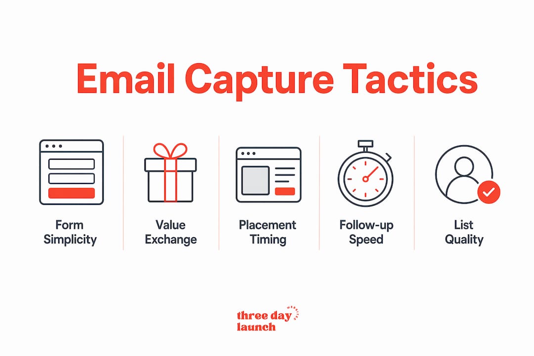
Placement and timing matter more than most people realize. A form buried in the footer collects almost nothing. Exit-intent pop-ups triggered when a cursor moves toward closing the tab convert at 2–5%, while scroll-triggered pop-ups convert at 8–15%. Using both together captures visitors at different stages of engagement. Well-designed signup pop-ups can drive 60–80% of new email subscribers for direct-to-consumer brands. That number shows just how much a single design decision controls your list growth.

Simplicity in form fields is non-negotiable. Removing one non-essential field can increase conversion rates by 30–50%. Every extra field you add is a reason for the visitor to stop and reconsider. Ask for a first name and email address. Save the phone number and company size for later.
Multi-step forms outperform single-page forms in most contexts. Multi-step and conversational forms boost conversion rates by approximately 30% compared to traditional single-page forms. The psychology behind this is called progressive disclosure. Once a visitor answers the first question, they feel invested and are far more likely to complete the rest.
Here is what a high-performing email capture form includes:
- A benefit-driven headline that states what the visitor gets, not what you want
- A single, prominent call-to-action button with specific text ("Send My Free Guide" beats "Submit")
- A one-line privacy assurance below the button ("No spam. Unsubscribe anytime.")
- Contrast between the button color and the surrounding page so it draws the eye immediately
- Mobile-friendly sizing with tap targets at least 44px tall
Pro Tip: Google's mobile intrusive interstitial penalty targets full-screen pop-ups that cover more than 30% of the mobile screen or lack a clearly visible close button. Always test your pop-ups on a real mobile device before publishing.
How does the value exchange impact email capture success?
The value exchange is the deal you offer a visitor in return for their email address. Most websites get this wrong by offering something too vague or too generic.
Visitors don't sign up for generic newsletters. They sign up to solve a specific problem. "Join our newsletter for tips" fails because it describes what you get, not what problem it solves. "Get the 5-step plan that helped 200 coaches book their first paying client" works because it speaks directly to a real, felt need.
Visitors want solutions, not subscriptions. A failure in the value exchange is the primary reason for low email capture rates. Your offer must align with what the visitor came to your site to find, or they will leave without converting.
Effective lead magnets share three traits. They solve one specific problem. They deliver results quickly. They match the content on the page where the form appears. A health coach running a blog post about stress management should offer a free breathing exercise guide, not a general wellness checklist. Contextual relevance between the page content and the offer is what makes the difference.
Visual cohesion also plays a bigger role than most marketers expect. Matching the value proposition visually with the rest of the website reduces distrust and increases capture rates. If your form looks like it was designed by a different person than the rest of your site, visitors notice. That visual disconnect signals a lack of professionalism and kills trust before the visitor even reads your offer.
Strong lead magnets for coaches and service providers include:
- A short PDF guide or checklist tied to a specific outcome
- A free mini-course delivered by email over 3–5 days
- A quiz that diagnoses a problem and delivers personalized results
- A free template or swipe file the visitor can use immediately
- A recorded webinar or training video on a high-demand topic
You can find more ideas on lead generation for coaches that apply directly to email capture design.
What are best practices for integrating email capture with follow-up workflows?
Capturing an email is only half the job. What happens in the next five minutes determines whether that lead converts or disappears.
Leads contacted within 5 minutes of form submission are about 100 times more likely to qualify than those contacted after 30 minutes. That is not a small difference. It means your form design must connect directly to an automated response system, not a manual inbox check.
Here is how to build a follow-up workflow that actually works:
- Connect your form to a CRM or email platform on day one. Tools like ConvertKit, ActiveCampaign, or Mailchimp all offer direct integrations with most website builders. Do not let leads sit in a spreadsheet. You can read more about email marketing platform options built for coaches and service providers.
- Trigger an immediate confirmation email. This email should arrive within 60 seconds of signup. It confirms the subscriber's address, delivers the promised lead magnet, and sets expectations for what comes next.
- Build a nurture sequence of 5–7 emails. Space them over two to three weeks. Each email should deliver value first and pitch second. Teach something useful, then connect it to your offer.
- Set up a re-engagement campaign for inactive subscribers. Automated follow-ups to ghosted leads can reactivate prospects who abandoned the funnel, turning lost contacts into revenue with no added acquisition cost.
- Tag subscribers based on behavior. If someone clicks a link about a specific service, tag them and send a targeted follow-up. Behavioral tagging turns a generic list into a segmented, high-converting asset.
Pro Tip: Use a double opt-in for your email list. Yes, it reduces raw signup numbers slightly. But it filters out fake addresses and uninterested subscribers, which protects your sender reputation and improves deliverability long-term.
How can web design contribute to sustained list quality and audience engagement?
A large email list with low engagement is a liability, not an asset. List quality significantly outweighs quantity. 1,000 engaged subscribers outperform 10,000 cold ones in deliverability and ROI. That reality should shape every design decision you make around email capture.
You can learn more about growing a quality email list with strategies built for small businesses and marketers who care about results over vanity metrics.
Design choices that protect list quality over time include:
Let's Launch Your Strategic Coaching Website
Your first step is to book a free call so we can get your questions answered.
Book A Free Call- Double opt-in confirmation pages that filter out bots and mistyped addresses before they enter your list
- Transparent consent language on every form that tells subscribers exactly what they are signing up for
- Segmentation at the point of capture by asking one qualifying question ("Are you a new coach or established coach?") so you can send relevant content from day one
- Regular form testing using A/B tests on headlines, button text, and offer framing to keep conversion rates climbing
The table below shows how different design tactics affect list quality and engagement over time.
| Design tactic | Primary benefit | Impact on list quality |
|---|---|---|
| Double opt-in | Filters fake addresses | High: reduces bounce rate |
| Segmentation at signup | Enables targeted content | High: improves open rates |
| Exit-intent triggers | Captures leaving visitors | Medium: mixed intent quality |
| Scroll-triggered pop-ups | Targets engaged readers | High: self-selects interested visitors |
| Inline embedded forms | Reaches content-engaged users | High: strong contextual relevance |
Cross-channel capture also strengthens your list. Your email signup should appear on your website, your social media bio links, your podcast show notes, and your YouTube descriptions. Each channel attracts a slightly different audience segment. Capturing across all of them builds a richer, more diverse list. You can see how high-converting coach websites handle this across multiple touchpoints.
Key Takeaways
Effective email capture web design combines strategic form placement, a compelling value exchange, and automated follow-up workflows to convert visitors into qualified leads consistently.
| Point | Details |
|---|---|
| Form simplicity drives conversions | Removing one unnecessary field can boost completion rates by 30–50%. |
| Value exchange determines signup intent | Specific, problem-solving offers outperform generic newsletter pitches every time. |
| Speed of follow-up is critical | Leads contacted within 5 minutes are 100x more likely to qualify than those reached later. |
| List quality beats list size | 1,000 engaged subscribers deliver better ROI than 10,000 cold contacts. |
| Mobile compliance protects SEO | Pop-ups must cover less than 30% of the mobile screen to avoid Google penalties. |
What I've learned from watching coaches lose leads every week
Here is the uncomfortable truth I keep seeing: most coaches have a traffic problem they think is a design problem, and a design problem they think is a traffic problem. They pour money into ads or SEO, get visitors to the site, and then watch those visitors leave because the email capture form is an afterthought.
The form is a one-line text box at the bottom of the page. The offer is "Subscribe to my newsletter." The follow-up is a welcome email sent 24 hours later. That sequence does not work in 2026. Visitors make a decision about your offer in seconds, and if the form does not immediately communicate value, they are gone.
What actually works is treating the email capture form as a product in itself. It needs a headline, a clear benefit, a visual design that matches the rest of the site, and a backend workflow that responds instantly. When Three Day Launch builds websites for coaches, the email capture strategy is baked into the design from the start, not added as an afterthought after the site goes live.
The other thing I would push back on is the obsession with list size. I have seen coaches with 500 subscribers generating consistent monthly revenue because those subscribers are engaged, segmented, and nurtured well. Chasing raw numbers by using weak offers or pre-checked consent boxes is a fast way to build a list that hurts your sender reputation and delivers nothing. Build slower. Build better. You can also explore lead nurturing strategies that turn a small, quality list into a real revenue channel.
How Three Day Launch builds email capture into every website
Getting email capture right from day one requires more than a plugin and a prayer.

Three Day Launch designs custom websites for coaches that integrate email capture forms, lead magnets, and marketing platform connections from the ground up. Every site is built with conversion-focused design that puts your signup forms in the right places, with the right offers, connected to the right follow-up tools. Coaches in life, health, and finance have seen real list growth and client inquiries within weeks of launch. If you want a site that captures leads while you sleep, Three Day Launch can have it live in three days.
FAQ
What is the role of email capture in web design?
Email capture web design is the practice of placing forms and interactive elements on a website to collect visitor email addresses for marketing and lead nurturing. It converts anonymous traffic into a contactable audience you can follow up with directly.
How many form fields should an email capture form have?
Two fields is the standard: first name and email address. Removing one non-essential field can increase conversion rates by 30–50%, so keep it as short as possible.
What makes a lead magnet effective for email capture?
An effective lead magnet solves one specific problem quickly and matches the content on the page where the form appears. Generic offers like "subscribe for tips" consistently underperform compared to specific, outcome-focused incentives.
How does mobile design affect email capture rates?
Google's intrusive interstitial penalty targets pop-ups that cover more than 30% of the mobile screen or lack a visible close button. Non-compliant pop-ups hurt both SEO rankings and user experience, reducing capture rates.
Why does follow-up speed matter after someone submits a form?
Leads contacted within 5 minutes of submission are about 100 times more likely to qualify than those reached after 30 minutes. Automated email sequences triggered immediately after signup close this gap without requiring manual effort.