Coaching Site Conversion Best Practices for Coaches
Boost coaching site conversions with proven best practices: clear messaging, structured pages, strong CTAs, and trust signals that turn visitors into clients.

Coaching site conversion best practices are the design principles, messaging strategies, and technical decisions that turn website visitors into booked clients. Your website is your storefront and your handshake. If it confuses visitors, buries your offer, or asks too much too soon, they leave without ever reaching out. The good news? Most coaching sites fail for fixable reasons. Clear messaging, specific calls to action, and a well-structured client journey are the core levers. Get those right, and your site stops being a digital brochure and starts doing real work for your business.
1. Coaching site conversion best practices start with site structure
Your coaching website is not a collection of pages. It is a conversion system where every page has exactly one job. Coachful describes this as an "operating system" model: Home builds trust and directs traffic, About establishes credibility, Services explains your offer, Booking captures the lead, Blog drives organic discovery, and Privacy Policy handles compliance.
When pages share jobs or skip steps, the visitor journey breaks. A home page that tries to explain your full methodology, list your credentials, and collect a lead all at once ends up doing none of those things well. Each page should answer one question and point clearly to the next step.
- Home: Who you help and what changes for them
- About: Why you are the right person to help
- Services: What the program includes and what it costs
- Booking: One clear action with zero distractions
- Blog: Educational content that earns search traffic
Pro Tip: Test your page jobs one at a time. Ask a friend who does not know your business to read a single page and tell you what they think you want them to do next. If they hesitate, the page has more than one job.
2. Why outcome-focused messaging outperforms credentials on coaching pages

Visitors do not come to your site to read your biography. They come because they have a problem and want to know if you can fix it. Outcome-focused messaging nearly doubles conversion rates compared to copy that leads with credentials or process descriptions.
The difference is simple. "Certified ICF coach with 10 years of experience" tells visitors about you. "Go from burned out to fully booked in 90 days" tells visitors what changes for them. The second version answers the only question that matters at first glance: "Is this for me?"
Strong outcome-focused headlines share three traits:
- They name a specific result, not a general improvement
- They speak directly to a recognizable pain or goal
- They imply a timeframe or transformation arc
Weak copy sounds like: "I help professionals reach their potential." Strong copy sounds like: "I help first-time managers lead with confidence in 60 days." The specificity does the heavy lifting. It also filters out the wrong clients, which saves you time on discovery calls.
3. Crafting calls to action that actually increase coaching site conversions
Vague calls to action kill conversions. "Learn More" and "Get Started" tell visitors nothing about what happens next, and that uncertainty is enough to make them pause and leave. Specific CTA wording can increase conversion rates by 161% compared to generic alternatives.
A strong coaching CTA contains four elements: an action verb, a clear benefit, a risk reducer, and a specific next step. "Book Your Free 30-Minute Strategy Session" works because it tells visitors exactly what they get, how long it takes, and that it costs nothing to try.
- Action verb: Book, Schedule, Apply, Claim
- Benefit: Free session, personalized plan, clarity call
- Risk reducer: Free, no commitment, cancel anytime
- Specificity: 30-minute, strategy session, discovery call
Place CTAs in at least three spots per page: above the fold so visitors see it immediately, mid-page after you have explained the offer, and at the bottom after testimonials close the sale. Specific CTAs lower anxiety by telling visitors exactly what happens when they click.
Pro Tip: Run A/B tests on one CTA element at a time. Change the verb first, measure for two weeks, then test the benefit phrase. Changing everything at once makes it impossible to know what moved the needle.
4. How to reduce form friction and capture more leads
One-field forms convert at 18.2% while forms with nine or more fields convert at only 4.2%. That gap is enormous, and most coaching sites sit closer to the nine-field end without realizing it. Neil Patel's research recommends one to two fields for top-of-funnel lead capture and three to four fields for core lead generation forms.
Here is how to audit and fix your forms:
- Count your fields. If your contact form asks for name, email, phone, coaching goal, budget, and how they found you, cut it in half. Start with name and email only.
- Audit field-level drop-offs. Tools like Google Analytics and Hotjar show where visitors abandon forms. Remove or reorder the fields that cause the most exits.
- Check mobile behavior. Technical issues like broken tracking and increased mobile traffic can cause top-of-funnel drop-offs even when the form itself looks fine on desktop.
- Use multi-step forms for longer applications. Break a six-field form into two steps of three fields each. The first click commits the visitor psychologically, and completion rates rise.
- Verify your tracking events. A form that appears to underperform may actually be converting fine. Broken tracking events misreport completions and lead to bad decisions.
The goal is to ask for the minimum information needed to start the conversation. You can collect the rest on the discovery call.
5. Using social proof and delivery framing to overcome buyer hesitation
Most coaches post testimonials that say things like "Working with Sarah changed my life!" That kind of praise feels good but does not convert. Completion-focused testimonials are among the top conversion drivers on coaching sales pages, and they work because they answer the real question buyers have: "Will I actually finish this and get results?"
A completion-focused testimonial sounds like: "I went from skipping sessions to completing all 12 weeks and landing my first corporate client." That tells the next buyer that the program is doable and that results follow when you do the work.
Delivery framing matters just as much as testimonials. Communipass data shows that detailed delivery descriptions drive conversion from the typical 4–8% range to 25% or more on warm traffic. Vague descriptions like "ongoing support and accountability" do not reassure anyone. Specific descriptions like "weekly 60-minute Zoom calls, a private Slack channel, and a 24-hour response guarantee" remove doubt.
"I almost didn't sign up because I wasn't sure I'd stick with it. Seeing the exact schedule and the money-back guarantee made me feel safe enough to try." — A real buyer objection, turned into a conversion by clear delivery framing.
Additional trust builders worth adding:
- Cohort caps ("Only 4 spots remaining this quarter")
- Time-bound guarantees ("Full refund if you complete all sessions and don't see results")
- Program completion rates from past cohorts
6. How to structure your coaching page message by buyer stage
Your page message should match where the visitor is in their decision process. Coaching page messages aligned with buyer decision stages follow a clear pattern: outcome and fit at the top, proof in the middle, and a clear next step at the bottom.
Let's Launch Your Strategic Coaching Website
Your first step is to book a free call so we can get your questions answered.
Book A Free CallThe top of the page answers: "Is this for me and will it work?" Lead with your outcome-focused headline and a one-sentence description of who you serve. The middle of the page answers: "Can I trust this person?" This is where testimonials, credentials, and case studies belong. The bottom of the page answers: "What do I do next?" One CTA, no competing links, no distractions.
Coaches who mix these stages lose visitors. Putting testimonials above the fold before the visitor understands the offer is like showing reviews for a product you have not described yet. Sequence matters as much as content. A well-structured coaching website design that follows this flow consistently produces higher inquiry rates than a visually impressive site with scrambled messaging.
7. Running clean A/B tests to keep improving conversions
Conversion rate optimization (CRO) is the practice of testing website changes to find what drives more clients to take action. The biggest mistake coaches make with CRO is testing too many things at once. Testing single page elements one at a time keeps your data clean and your conclusions reliable.
Follow this sequence for effective testing:
- Set up reliable tracking first. Before you test anything, confirm that your booking form, CTA clicks, and thank-you page views are all tracked correctly in Google Analytics or a similar tool.
- Identify your biggest drop-off point. Use funnel reports to find where visitors leave. That is where your first test should focus.
- Test one variable at a time. Change the headline, measure for two to four weeks, then move to the CTA. Never run two tests simultaneously on the same page.
- Measure revenue events, not vanity metrics. Track booked calls and submitted applications, not just page views or time on site.
- Set benchmarks by traffic type. Warm traffic from referrals converts differently than cold traffic from search. Set conversion benchmarks by traffic source so you are comparing apples to apples.
Patience is part of the process. A test that runs for only three days rarely produces statistically meaningful data. Give each test enough time to collect at least 100 conversions before drawing conclusions.
Key takeaways
Coaching site conversions improve most when you fix structure, messaging, and friction before touching design or aesthetics.
| Point | Details |
|---|---|
| Structure pages with single jobs | Each page should answer one question and direct visitors to a clear next step. |
| Lead with outcomes, not credentials | Outcome-focused headlines convert at nearly double the rate of credential-first copy. |
| Use specific CTAs | Specific wording like "Book Your Free 30-Minute Strategy Session" outperforms vague alternatives by up to 161%. |
| Minimize form fields | Keep top-of-funnel forms to one or two fields; longer forms drop conversion rates sharply. |
| Frame delivery in detail | Specific program descriptions and completion-focused testimonials push conversions past 25% on warm traffic. |
What I've learned building coaching sites that actually convert
Here is the uncomfortable truth I share with every coach we work with at Three Day Launch: most coaching sites do not have a design problem. They have a clarity problem. Coaches spend weeks picking fonts and colors, then launch a site that never explains who it is for or what changes when someone works with them.
The coaches I have seen get the fastest results are the ones who treat their website like a client intake system, not a portfolio. They think about what a visitor needs to know at each stage, and they build the site around that sequence. They also set up tracking before they start tweaking anything. Redesigning a page because you think it is underperforming, when your tracking is broken, is one of the most common and costly mistakes in this space.
My honest advice: start with your messaging. Get your outcome-focused headline right. Then fix your CTA. Then look at your form. Do those three things before you touch anything else, and you will see movement. The website copy is almost always the highest-leverage fix, and it costs nothing but time to get right.
SEO and conversion are not opposites, either. A page that Google can parse clearly and that visitors understand in three seconds is doing both jobs at once. Build for the human first, and the search engine will follow.
— Three Day Launch
Three Day Launch builds coaching sites designed to convert from day one
If you have read this far and realized your site needs more than a few tweaks, you are not alone. Most coaches come to us after months of trying to fix a site that was never built with conversion in mind.
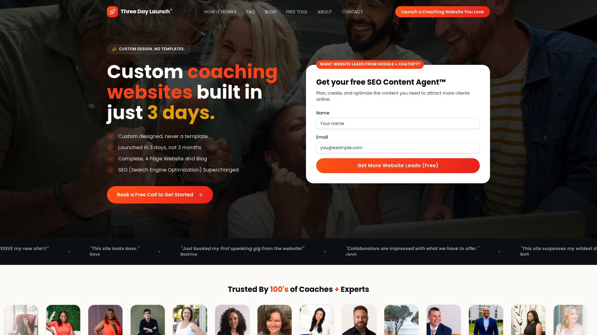
Three Day Launch builds fully custom, multi-page coaching websites in three days. Every site is designed around the conversion principles covered here: clear page jobs, outcome-focused copy, specific CTAs, and booking integration built in from the start. Coaches in life, finance, and health coaching have seen real growth in leads and memberships from organic traffic shortly after launch. If you are ready for a custom coaching website that works as hard as you do, Three Day Launch is ready to build it.
FAQ
What is a good conversion rate for a coaching website?
Typical coaching sales pages convert at 4–8% on warm traffic, while top-performing pages with strong delivery framing and social proof reach 25% or more. Cold traffic from search converts at a lower rate, so always benchmark by traffic source.
How many form fields should a coaching contact form have?
One-field forms convert at 18.2% while nine-field forms drop to 4.2%, so keep top-of-funnel forms to one or two fields. Collect additional details on the discovery call or in a multi-step form for longer applications.
What makes a coaching CTA effective?
An effective CTA includes an action verb, a specific benefit, and a risk reducer. "Book Your Free 30-Minute Strategy Session" outperforms "Get Started" because it tells visitors exactly what happens next and removes uncertainty.
Why does outcome-focused messaging convert better for coaches?
Visitors arrive with a problem, not an interest in your credentials. Messaging that names a specific result they want answers their first question faster and filters in the right clients, which is why it nearly doubles conversions compared to credential-first copy.
How often should coaches run A/B tests on their website?
Test one element at a time and run each test for at least two to four weeks to collect reliable data. Focus first on the page element where visitors drop off most, such as the headline or booking form, before testing secondary elements.