Examples of High-Converting Coach Sites That Book Clients
See real coach website examples that convert visitors into booked clients — problem-first headlines, transparent pricing, authentic photos, and proven layouts you can copy.

Examples of High-Converting Coach Sites That Book Clients
A high-converting coach website is one that moves a visitor from curious stranger to booked client through clear messaging, visible trust signals, and a structured path to action. The best examples of high-converting coach sites share four non-negotiable traits: problem-focused headlines, authentic coach photography, transparent pricing, and a logical visitor journey. Sites like Thrievherd Career Coaching, Leah Pearlman's booking page, Jeremiah O'Brian's coaching hub, and Smart Founders each demonstrate how these elements work together. This article breaks down exactly what they do right, so you can apply the same principles to your own site.
1. What makes a coaching website convert: core elements from top examples
Conversion rate optimization (CRO) in the coaching space is less about flashy design and more about earning trust at every scroll. The industry term for this is progressive trust architecture, and the best coach site layouts build it in a specific sequence.
Problem-first headlines outperform aspiration-first every time. 2026 CRO data shows that a headline like "Is Your Current Career Holding You Back?" drives higher scroll depth and more inquiries than "Discover The Career You Were Meant For." The first headline meets the visitor where they are. The second asks them to imagine a future they haven't committed to yet.
Authentic photography is non-negotiable. Coach headshots on websites directly increase conversions because visitors feel connected and safe before they ever read a word of copy. Coaching is a vulnerable purchase. A generic stock photo of a handshake signals that you don't take your own brand seriously.
Transparent pricing builds trust faster than any testimonial. Tiered pricing tables that show a free consultation alongside individual and package session options give visitors the information they need to self-qualify. That reduces friction and increases the quality of every lead you get.
Here are the core elements every effective coaching web page needs:
- A problem-first headline above the fold
- A high-quality personal photo of the coach
- A clear, tiered pricing table with a free consultation option
- A structured visitor journey: problem recognition, transformation hope, process clarity, coach trust, then CTA
- A visual roadmap (like a 12-week program layout) that makes the service feel real and achievable
Pro Tip: Don't bury your pricing. Coaches who hide their rates lose visitors who assume the worst. Transparency is a conversion tool, not a liability.
2. Thrievherd Career Coaching: pain-first messaging done right
Thrievherd Career Coaching is one of the clearest successful coaching website examples of pain-first messaging executed at a high level. The headline immediately names the visitor's frustration, which stops the scroll and creates an emotional hook.
The site pairs that headline with detailed coach profiles that include real photos, credentials, and personal backstory. Conversion improves when websites follow the psychological sequence of identification, hope, process clarity, coach trust, and then a call to action. Thrievherd maps this sequence almost perfectly across its page structure.
What coaches can steal from this site: lead with the problem your client is living right now, not the outcome they hope for. Then show them the coach behind the solution before you ask them to do anything.
3. Leah Pearlman's booking page: transparent pricing as a conversion tool
Leah Pearlman's coaching booking page is a masterclass in pricing transparency. The page shows a 45-minute free consultation alongside 90-minute individual sessions and bundled package discounts, all visible without clicking or requesting a quote.
Showing tiered pricing with free consultations increases visitor trust and conversion rate. The logic is simple: when visitors can see exactly what they're getting and what it costs, they stop hesitating and start deciding. Personal storytelling on the page reinforces the pricing by giving context to why the work matters.
This is one of the most replicable high-conversion coaching examples you'll find. You don't need a complex funnel. You need honest numbers and a human story behind them.
4. Jeremiah O'Brian: segmented services with distinct CTAs
Jeremiah O'Brian's coaching site solves a problem most coaches ignore: what happens when you offer more than one thing? His site uses a three-pillar structure to route visitors to coaching, courses, or consulting, each with its own dedicated call to action.
Segmenting coaching services into distinct pathways with separate CTAs guides visitors effectively and improves lead quality. A visitor looking for a one-on-one coach and a visitor shopping for a self-paced course have completely different needs. Sending both to the same generic "Work With Me" page loses both of them.
The site also uses a dark premium color palette of navy, gold, and fire gradients. That palette signals high-value, professional services before a single word is read. Color is a conversion tool, not just a design preference.
5. Smart Founders: video case studies as humanized proof
Smart Founders targets coaches who help business owners sell their companies, which is about as high-ticket as coaching gets. The site uses customer video testimonials where real clients name the acquirers of their businesses. That level of specificity is impossible to fake.
Video case studies and humanized proof significantly increase trust and conversion rates in high-ticket coaching sales. A written testimonial saying "this changed my life" is easy to dismiss. A video of a real person naming a real company they sold is not. If you want to learn how to incorporate video into your site effectively, this approach is the gold standard.
The takeaway: the more specific your proof, the more believable it is. Vague testimonials are wallpaper. Specific stories are evidence.
6. The Coherence Coach: progressive disclosure for lead generation
The Coherence Coach's 12-week Nervous System Reset page is a strong example of progressive disclosure done well. Rather than dumping every detail about the program on a single scrolling page, the site reveals information in stages as the visitor moves through the flow.
Multi-step intake forms and service grids that let visitors self-select increase quality lead capture. Visitors who complete a multi-step form are more committed than those who fill out a single field. Each step filters out low-intent visitors and qualifies the ones who stay.
The 12-week roadmap format also does something smart: it lets prospects mentally walk through the transformation before they commit. Copy focused on psychological milestones like a structured weekly roadmap boosts commitment likelihood because the client can already picture themselves inside the program.
7. Comparing coach site layouts: which design works for your niche?
Not every coaching niche needs the same design approach. The best coach site designs match their visual language and structure to the expectations of their specific client.
Let's Launch Your Strategic Coaching Website
Your first step is to book a free call so we can get your questions answered.
Book A Free Call| Coaching Niche | Color Palette | Layout Type | Best CTA Format |
|---|---|---|---|
| Executive coaching | Navy, gold, charcoal | Three-pillar hub | "Schedule a Strategy Call" |
| Life coaching | Warm neutrals, pastels | Single-scroll narrative | "Book a Free Consult" |
| Health and wellness | Earth tones, soft greens | Visual journey map | "Start Your Reset" |
| Business/startup coaching | Bold, high-contrast | Video-forward with proof | "Watch Client Stories" |
| Career coaching | Clean whites, blues | Pain-first headline page | "See If We're a Fit" |
Color palette choices impact conversion success at the sub-niche level. Executive coaches who use soft pastels signal a mismatch between their brand and their client's expectations. Wellness coaches who use aggressive dark themes can feel cold and clinical. Match your palette to your client's emotional state when they arrive on your site.
Pro Tip: If you offer both one-on-one coaching and group programs, build separate landing pages for each. One page trying to serve two audiences serves neither.
8. Practical tips for coaches to apply these conversion principles
You don't need to rebuild your entire site to start converting better. These are the highest-leverage changes you can make right now, drawn directly from the coach website features that consistently drive results.
- Lead with the problem, not the solution. Rewrite your headline to name the specific frustration your ideal client is feeling today.
- Replace stock photos with real ones. A genuine photo of you in your workspace or with a client builds more trust than any professionally staged image.
- Add a pricing table. Even a simple three-tier layout with a free consultation option removes the biggest objection most visitors have.
- Frame your copy around outcomes, not features. "You'll stop second-guessing every career decision" converts better than "Six sessions of career coaching."
- Use a visual roadmap. A simple week-by-week or phase-by-phase breakdown makes your intangible service feel concrete and achievable.
- Place CTAs at trust-building moments, not just at the top. Put your booking button after your bio, after your testimonials, and after your pricing table.
Strong coach website copy ties all of these elements together. Design gets visitors to stay. Copy gets them to book.
Key takeaways
High-converting coach websites succeed by combining problem-first messaging, authentic photography, transparent pricing, and a structured trust sequence that guides visitors to book.
| Point | Details |
|---|---|
| Problem-first headlines win | Lead with the visitor's current frustration, not the outcome they hope for. |
| Transparent pricing builds trust | Show tiered pricing and a free consultation option to reduce friction and qualify leads. |
| Authentic photos convert | Real coach photos reduce interpersonal risk and make visitors feel safe enough to reach out. |
| Segment your services | Use separate CTAs for different offerings to guide each visitor to the right path. |
| Progressive disclosure qualifies leads | Multi-step forms and staged information reveal filter out low-intent visitors effectively. |
What I've learned building coach sites that actually convert
Here's an uncomfortable truth I've seen play out over and over: most coaches spend months agonizing over their brand colors and zero time thinking about their headline. The headline is the only thing that determines whether a visitor reads the next sentence. Everything else is secondary.
The shift I've watched make the biggest difference in 2026 is coaches moving away from "here's what I offer" pages toward "here's the problem I solve" pages. That's not a copywriting trend. It's a psychological reality. People don't buy coaching because they want coaching. They buy it because something in their life isn't working and they want it fixed.
I've also seen coaches overcomplicate their sites with too many options, too many pages, and too many CTAs. The sites that convert best are almost always simpler than you'd expect. One clear problem. One clear solution. One clear next step. The Thrievherd and Leah Pearlman examples prove this. Neither site is technically complex. Both convert because they respect the visitor's decision-making process.
The coaches who struggle with their websites are usually trying to explain everything at once. The ones who succeed pick one visitor, speak to one problem, and make one ask. That's the whole formula.
— Three Day Launch
Ready to build a coach site that converts from day one?
If you've been nodding along to these examples and thinking "my site doesn't do any of this," you're not alone. Most coaches launch with a template, a logo, and a prayer. The results speak for themselves.
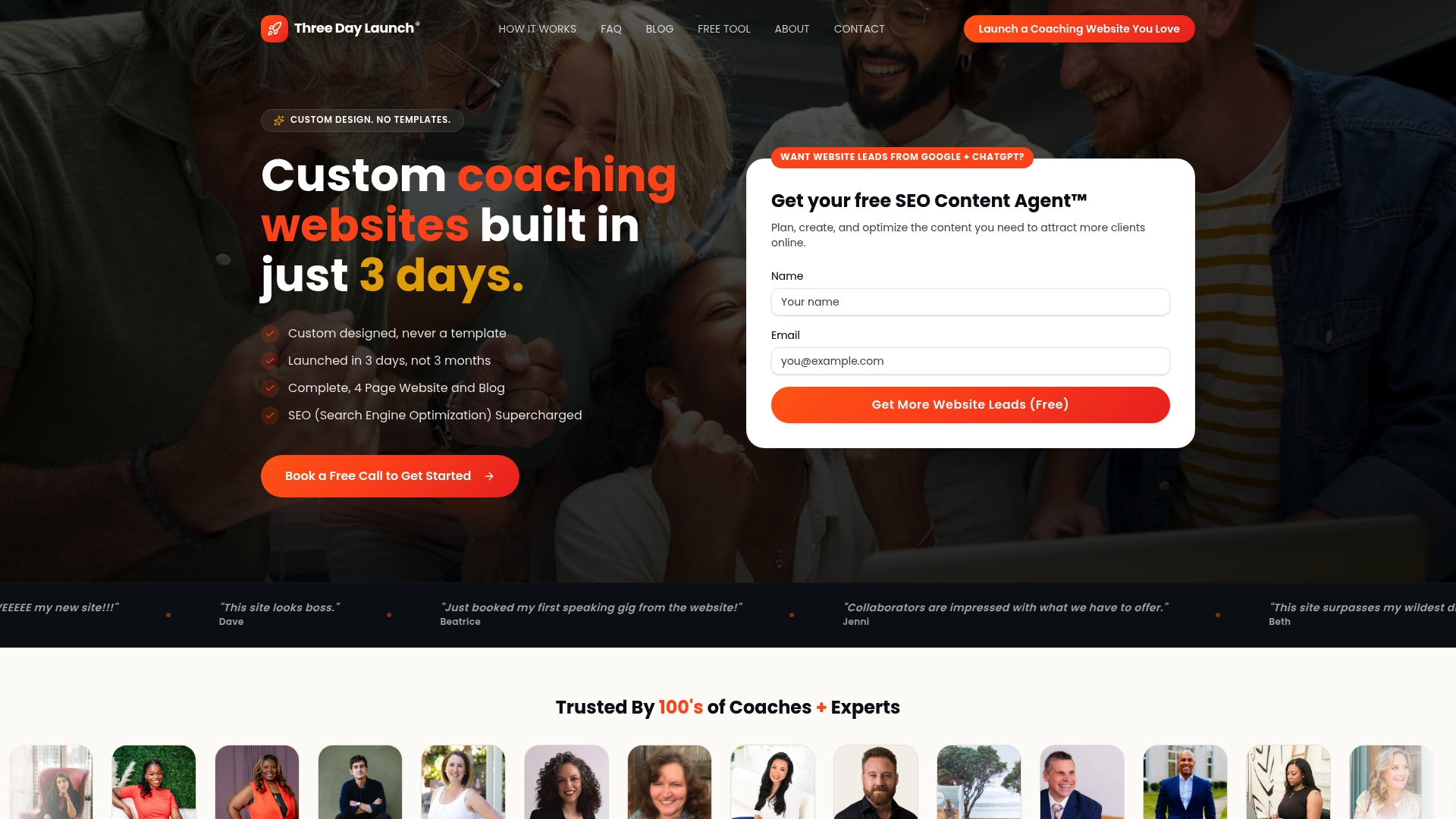
Three Day Launch builds fully custom, multi-page coaching websites in three days. Not templates. Not drag-and-drop builders. Real custom design built around the conversion principles you just read about, tailored to your coaching niche and your ideal client. Coaches in life, health, finance, and career niches have seen real growth in leads and bookings from organic traffic shortly after launch. If you're ready to stop losing visitors to a site that doesn't represent you, explore the custom coaching website service and see what's possible in 72 hours.
FAQ
What makes a coaching website high-converting?
A high-converting coaching website leads with a problem-focused headline, shows authentic coach photography, displays transparent pricing, and follows a trust-building sequence that ends with a clear call to action.
How important is pricing transparency on a coach site?
Pricing transparency is a direct conversion driver. Tiered pricing tables with a free consultation option increase visitor trust and reduce the friction that stops potential clients from booking.
Should I use video on my coaching website?
Yes. Video case studies with specific, named client results significantly increase trust and conversion rates, especially for high-ticket coaching programs.
What layout works best for coaches with multiple offerings?
A three-pillar or segmented layout with separate CTAs for each service works best. Distinct service pathways guide visitors to the right offer and improve the quality of leads you capture.
How do I choose the right color palette for my coaching site?
Match your palette to your niche and your client's expectations. Dark, premium tones like navy and gold work for executive and business coaches, while earth tones and soft greens suit health and wellness coaches.