Why Website Design Affects Inquiry Rates for Coaches
Website design directly determines whether a visitor trusts you enough to reach out. Learn the elements—visual design, messaging, navigation, and speed—that drive coach inquiry rates.
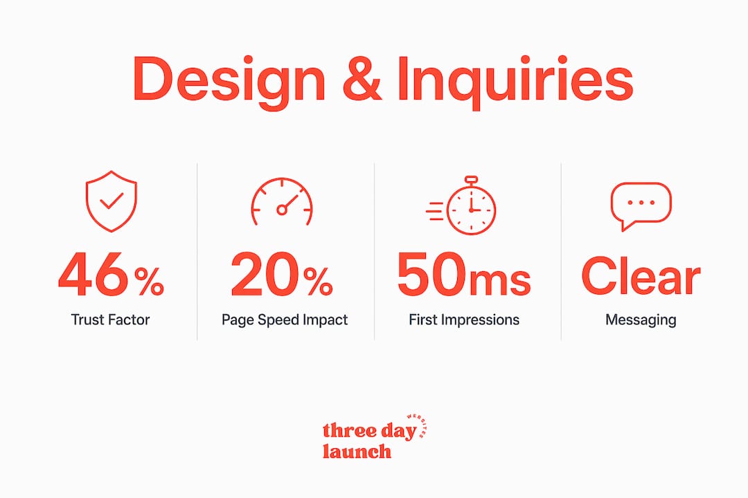
Website design directly determines whether a visitor trusts you enough to reach out, making it one of the most underestimated conversion levers a coach can control. 46.1% of users judge credibility based on visual design alone, before reading a single word of your copy. That judgment happens fast. Visitors decide trustworthiness within 50 milliseconds of landing on your site. Understanding why website design affects inquiry rates is not a design theory exercise. It is a direct revenue conversation, and every coach with a website needs to have it.
Which website design elements most influence inquiry rates?
Your website is your storefront and your handshake, all at once. The elements that shape whether someone fills out your contact form or clicks away fall into four clear categories: visual design, messaging clarity, navigation, and performance.
Visual design sets the tone before your words do. Layout, typography, and color scheme communicate professionalism at a glance. A cluttered homepage with mismatched fonts signals disorganization, and visitors associate that with the quality of your coaching. Consistent, polished visuals tell a different story. They say you pay attention to detail, and that you will bring that same care to your clients.

Messaging clarity is where most coach websites quietly lose inquiries. If a visitor lands on your homepage and cannot tell within five seconds what you do, who you help, and what to do next, they leave. Good design hierarchy reduces mental effort and increases conversions by guiding the eye toward the most important information first.
Navigation is the silent guide through your site. Confusing navigation and overly creative UI elements reduce inquiry rates by increasing visitor frustration. Predictable menus, clear page labels, and a logical flow from "who you are" to "how to work with you" keep visitors moving forward instead of bouncing.
Performance is the factor coaches most often overlook. A slow site kills credibility before the design even loads.
- Use a consistent color palette tied to your brand identity
- Choose readable fonts at appropriate sizes (16px minimum for body text)
- Place your primary call to action above the fold on every key page
- Keep your navigation to five items or fewer
- Compress images to reduce load times without sacrificing quality
Pro Tip: Audit your homepage with fresh eyes by asking someone unfamiliar with your business to describe what you do after five seconds on your site. Their answer will tell you everything about your messaging clarity.
How do classical and expressive aesthetics affect engagement?
Not all good design looks the same, and that is actually great news for coaches. Research published in the Corporate Reputation Review identifies two distinct aesthetic styles that affect user engagement in different ways, and knowing which one fits your situation can change your inquiry rate significantly.
Classical aesthetics rely on structure, symmetry, and predictability. Structured, symmetrical designs boost positive user perceptions and engagement intentions by signaling reliability and professionalism. If you are a finance coach or a corporate leadership coach with an established reputation, classical aesthetics reinforce the credibility your audience already expects.
Expressive aesthetics use unconventional layouts, bold imagery, and emotional visual storytelling. Expressive design increases engagement when corporate reputation is not yet strong, because it creates emotional connection where authority alone cannot. A newer health coach or life coach building their brand from scratch often benefits more from expressive design that makes visitors feel something.
| Design style | Best for | Primary effect |
|---|---|---|
| Classical aesthetics | Established coaches, B2B, finance | Builds trust through structure and predictability |
| Expressive aesthetics | Newer coaches, lifestyle, wellness | Creates emotional engagement and connection |
| Hybrid approach | Growing coaches with a defined niche | Balances credibility with personality |
The practical implication here is that there is no single "correct" design style. The right choice depends on where you are in your business and how your audience perceives you. A health coach who is just starting out and choosing between a clean corporate look and a bold, personality-driven design should lean expressive. An executive coach with ten years of corporate clients should lean classical.
Pro Tip: If you are unsure which aesthetic fits your brand, look at the websites of coaches your ideal clients already follow and trust. Their design choices are a direct signal of what your audience responds to.
Why clear messaging and CTAs matter more than you think
Visual appeal gets visitors to stay. Clear messaging and strong calls to action (CTAs) are what actually get them to reach out. These two elements are where the impact of design on inquiries becomes most measurable.
Here is a practical framework for getting this right:
- State your value proposition in the first sentence of your homepage. Not your credentials. Not your story. What you do, who you help, and what outcome they can expect. Visitors should not have to scroll to understand your offer.
- Limit each page to one primary goal. A page that asks visitors to book a call, download a freebie, join a newsletter, and follow you on Instagram is a page that converts nothing. Pick one action per page and design everything around it.
- Place CTAs near decision points. CTAs placed near decision points with clear, specific copy enhance conversion rates. "Book a Free Discovery Call" outperforms "Contact Me" every time because it tells the visitor exactly what happens next.
- Make your contact information easy to find. Hidden contact pages and buried email addresses are conversion killers. Your contact option should be in your navigation and repeated at the bottom of every service page.
- Use trust signals strategically. Testimonials, client results, certifications, and media mentions placed near your CTA reduce hesitation at the moment of decision. A visitor who is almost ready to inquire just needs one more reason to commit.
Poor messaging and confusing navigation cause abandonment even when the visual design is strong. You can have a beautiful website that generates zero inquiries because the visitor never understood what to do next. Coach website copy and design work together. Neither one alone closes the gap.
Pro Tip: Test your CTA copy by replacing vague phrases like "Learn More" or "Get Started" with outcome-specific language like "Start Losing Weight This Month" or "Get Your First Paying Client." Specificity converts.
Technical design factors that reduce friction and increase inquiries
You can have perfect visuals and crystal-clear messaging, and still lose inquiries to technical problems. Page speed, mobile usability, and form design are the unglamorous side of conversion optimization, and they matter enormously.
Page speed is not just a user experience issue. It is a conversion issue. A one-second mobile load delay cuts conversions by up to 20%. That is a direct, measurable hit to your inquiry rate for every second your site takes to load. Google's Core Web Vitals framework sets LCP under 2.5 seconds as the benchmark for a good user experience. If your site misses that mark, you are losing visitors before they even see your offer.
Mobile usability is non-negotiable in 2026. Poor mobile experience with broken layouts and slow pages causes immediate visitor drop-off. Tiny text, buttons that are hard to tap, and layouts that require horizontal scrolling all signal to a mobile visitor that your site was not built for them. That feeling transfers directly to how they perceive your coaching practice.
Here is what to check on the technical side:
Let's Launch Your Strategic Coaching Website
Your first step is to book a free call so we can get your questions answered.
Book A Free Call- Run your site through Google PageSpeed Insights and address any critical issues
- Test every page on a real mobile device, not just a browser simulator
- Keep contact forms short. Name, email, and one qualifying question is usually enough
- Use lazy loading for images so above-the-fold content loads first
- Check that all buttons and links are at least 44x44 pixels for easy tapping on mobile
The speed benefits for coaching websites extend beyond just keeping visitors on the page. Fast-loading sites are also perceived as more credible. A consistent design system and polished performance buffer credibility issues and make users more forgiving of minor errors. Speed is trust.
Pro Tip: Monitor your Core Web Vitals monthly through Google Search Console. Performance degrades over time as you add content and plugins, so a site that was fast at launch may be slow six months later.
Key takeaways
Website design affects inquiry rates because it controls trust, clarity, and ease of action at every stage of the visitor's decision to reach out.
| Point | Details |
|---|---|
| First impressions are instant | Visitors judge credibility within 50 milliseconds, so visual design must communicate trust immediately. |
| Aesthetic style should match your reputation | Use classical design for established credibility; use expressive design to build emotional connection when your reputation is still growing. |
| Messaging clarity drives conversions | State your value proposition immediately and limit each page to one clear call to action. |
| Speed is a conversion factor | A one-second mobile load delay cuts conversions by up to 20%, making page performance a direct revenue issue. |
| Trust signals close the gap | Testimonials, certifications, and client results placed near CTAs reduce hesitation at the moment of decision. |
What I've learned about design and inquiries after working with hundreds of coaches
Here is something I see constantly: a coach comes to us convinced they have a traffic problem. They want more visitors, more social posts, more SEO. But when we look at their site, the real issue is obvious. Their homepage does not say what they do. Their CTA is buried in a footer. Their contact form asks for seven pieces of information before a visitor has even decided they trust the coach.
The Aesthetic-Usability Effect is real, and it is underappreciated. Visually appealing websites are perceived as more usable and more credible, which means users are more patient with them. On a beautiful site, visitors blame themselves for confusion. On a messy site, they blame the business. That asymmetry has a direct effect on whether someone reaches out or moves on.
What I have also learned is that overdesign is just as damaging as underdesign. Coaches sometimes think more visual complexity signals more value. It does not. A noisy layout with competing colors, too many fonts, and animations everywhere creates cognitive overload. The visitor's brain works harder, and harder-working brains do not fill out contact forms. They close tabs.
The coaches who get the most inquiries from their websites share three things: a clear offer on the homepage, a design system that feels consistent from page to page, and a CTA that is impossible to miss. That is not a coincidence. That is conversion-focused design doing exactly what it is supposed to do. Your website is a marketing tool. Treat it like one.
— Three Day Launch
Get a conversion-focused coach website in three days
If reading this made you realize your current site is costing you inquiries, you do not have to spend months fixing it.
Three Day Launch builds fully custom, multi-page coaching websites in just three days, designed from the ground up to build trust, communicate your offer clearly, and convert visitors into inquiries. No templates, no back-and-forth for months, no guessing whether your design is working against you. Coaches in life, health, and finance have seen real results fast, including significant increases in leads and sales from organic traffic shortly after launch. If you are ready to stop losing inquiries to a website that does not represent you, get your custom site built by a team that understands what coaches need.
FAQ
Why does website design affect inquiry rates so much?
Website design shapes the trust and clarity visitors need before they will reach out. Since 46.1% of users judge credibility based on visual design, a poorly designed site signals low professionalism before a visitor reads a word.
How fast does a visitor decide whether to stay on your site?
Visitors form a first impression in approximately 50 milliseconds. That split-second judgment determines whether they explore further or leave, which is why website layout and customer engagement are inseparable from inquiry rates.
What is the most common reason coach websites get low inquiries?
Most coaches mistake low inquiry rates for a traffic problem when the real issue is conversion-focused design and messaging clarity. A visitor who cannot quickly understand your offer and find your CTA will not reach out, regardless of how much traffic you drive.
Does page speed really affect how many inquiries I get?
Yes, directly. A one-second delay in mobile load time cuts conversions by up to 20%, meaning slow sites lose a measurable percentage of potential inquiries before the visitor even sees your content.
Should I use a bold, expressive design or a clean, classic one?
It depends on your reputation and audience. Classical aesthetics build trust for established coaches, while expressive aesthetics create emotional engagement for coaches who are still building their reputation. A hybrid approach works well for coaches with a defined niche and a growing audience.