How Mood Boards Guide Web Design for Better Results
Learn how mood boards guide web design to align teams, prevent revisions, and create cohesive, on-brand websites that convert visitors into clients.
How Mood Boards Guide Web Design for Better Results
A mood board is a curated collection of visual references that defines the emotional and aesthetic direction of a website before any actual design begins. Think of it as the creative brief made visual. Understanding how mood boards guide web design separates designers who produce cohesive, on-brand results from those who spend weeks revising misaligned mockups. Mood boards are distinct from wireframes and style guides. They define feel, not structure or technical specs. Used at the start of a project, they align everyone on the team before a single pixel gets placed.
How mood boards shape visual direction and branding
Mood boards create a shared visual language between designers, clients, and stakeholders. Without that shared language, everyone walks into the project with a different picture in their head. One person imagines "clean and modern." Another imagines "minimal and cold." A mood board makes those abstract words concrete.
The practical impact shows up in every design decision that follows:
- Color palette: A mood board filled with warm earth tones signals a completely different palette than one built around cool blues and sharp whites.
- Typography: Seeing serif fonts in context tells you far more than the word "elegant" ever could.
- Imagery style: Candid photography versus polished studio shots creates a totally different emotional experience for site visitors.
- UI elements: Button shapes, icon styles, and spacing preferences all flow naturally from a well-built mood board.
Mood boards define emotional direction without touching layout or technical specs. That separation is the point. You lock in the feel before you ever touch structure.
Pro Tip: Pull references from outside your client's industry. A health coach's website can draw visual inspiration from luxury hospitality or editorial fashion. Out-of-sector references produce more distinctive results and help you avoid generic design tropes that make every site in a niche look identical.

Inconsistent branding is one of the most common problems in web design. A mood board prevents it by forcing every visual choice through a single filter early on. If an element doesn't match the board's emotional tone, it doesn't make it into the final design.
How to create a mood board for web design projects
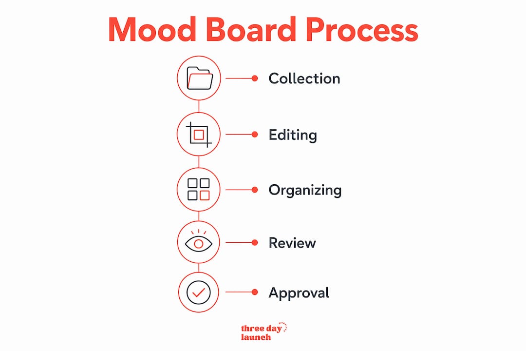
The best mood boards follow a two-phase process: collect widely, then edit ruthlessly. Skipping either phase produces a board that is either too scattered or too narrow.
-
Start with a broad collection phase. Industry best practice calls for gathering 40–60 raw references before you edit anything. Pull from typography samples, photography, textures, color swatches, and examples from outside your client's industry. Thematic diversity at this stage gives you room to pivot direction without starting over.
-
Edit down to a cohesive narrative. Remove anything that doesn't support the core emotional direction. Every element that stays must earn its place. A mood board that tries to say everything ends up saying nothing.
-
Organize by visual category. Group references by color, typography, imagery, and UI style. This structure makes it easier for stakeholders to give specific, useful feedback instead of vague reactions.
-
Add captions and keywords. Label each section with the emotional quality it represents. "Trustworthy and grounded" or "energetic and bold" gives reviewers a frame of reference. It also keeps the board from becoming a pile of pretty pictures with no strategic intent.
-
Use a digital tool for collaboration. Digital mood boards support the full range of modern UI needs, including animations and hover effects. They also allow remote team collaboration across the typical three-to-six-month web development cycle, so the board stays alive and accessible throughout the project.
Pro Tip: Before you build the board, run a spectrum poll with your client. Ask them to choose between pairs of adjectives: "playful vs. serious," "bold vs. subtle," "warm vs. cool." Their answers translate abstract preferences into a concrete direction, which makes the mood board far easier to build and get approved.
Here's a quick reference for what to include at each stage:
| Phase | Action | Goal |
|---|---|---|
| Collection | Gather 40–60 diverse references | Build a wide creative foundation |
| Editing | Remove non-aligned elements | Create a focused, intentional board |
| Organization | Group by color, type, imagery | Enable clear stakeholder feedback |
| Annotation | Add captions and keywords | Anchor emotional intent to visuals |
| Collaboration | Use a digital platform | Keep the board accessible and current |
How do mood boards improve stakeholder communication?
Mood boards translate abstract preferences into concrete visuals. That translation is where most web projects either succeed or fall apart early.
Clients rarely speak in design terms. They say things like "I want it to feel premium" or "I don't want it to look corporate." A mood board gives those words a visual anchor. Mood boards clarify emotional intent without pulling the conversation into layout or technical decisions too soon. That keeps early feedback focused and productive.
"Getting early sign-off on a mood board reduces mid-project pivots by giving you an agreed-upon visual reference when clients request design changes later. It functions as a visual contract, not just inspiration."
This is where mood boards become a defensive tool. When a client asks for a change three weeks into development, you can point back to the approved board and ask whether the requested change aligns with the direction they already signed off on. That single reference point prevents costly design pivots and keeps the project on track.
The most frequent cause of creative fragmentation is a mood board that exists separately from the project brief. When the board lives in a different folder from the brief, the wireframes, and the copy doc, it gets ignored. Keeping mood boards integrated with active project documents maintains alignment across every stage of the project.
A few practices that make mood boards work harder as communication tools:
- Share the board in the same workspace as the project brief and timeline.
- Reference it explicitly during design reviews, not just at kickoff.
- Update it when the creative direction shifts, so it always reflects the current agreement.
- Use it to onboard new team members quickly without lengthy briefings.
How do mood boards differ from wireframes and style guides?
Let's Launch Your Strategic Coaching Website
Your first step is to book a free call so we can get your questions answered.
Book A Free CallThese three tools serve completely different purposes, and confusing them creates real problems in a project workflow.
A mood board defines emotional and aesthetic direction. It answers the question: "How should this website feel?" It contains zero layout information and zero technical specifications. It appears at the very start of a project, before any structural decisions are made.
A wireframe maps structure and function. It answers: "Where does each element go, and how does the user move through the site?" Wireframes are intentionally stripped of color, typography, and imagery so that layout decisions stay separate from aesthetic ones.
A style guide codifies the final design system. It answers: "What are the exact hex codes, font sizes, spacing rules, and usage guidelines?" Style guides are created after the mood board is approved. Mood boards precede and inspire style guides, providing the emotional foundation that the style guide then formalizes.
| Tool | Primary focus | When it's used | What it defines |
|---|---|---|---|
| Mood board | Emotion and aesthetic | Project start | Feel, tone, visual direction |
| Wireframe | Structure and function | Mid-project | Layout, navigation, user flow |
| Style guide | Design system rules | Post-approval | Colors, fonts, spacing, usage |
The workflow runs in sequence: mood board first, wireframes second, style guide last. Skipping the mood board and jumping straight to wireframes is one of the most common reasons web projects end up with technically sound layouts that feel completely wrong for the brand.
Key Takeaways
Mood boards are the most underused alignment tool in web design, and using them correctly prevents the majority of costly mid-project revisions.
| Point | Details |
|---|---|
| Mood boards define feel, not structure | They establish emotional and aesthetic direction before layout or technical work begins. |
| Collect 40–60 references first | Start broad, then edit ruthlessly to build a focused, intentional board. |
| Use them as a visual contract | Early stakeholder sign-off on a mood board prevents costly changes later in the project. |
| Integrate with project documents | A mood board kept separate from the brief loses its alignment power quickly. |
| Mood boards precede style guides | They set the emotional foundation that style guides then formalize into exact specifications. |
What I've learned from building mood boards that actually work
Here's the uncomfortable truth about mood boards: most of them are just pretty picture collections with no strategic spine. Designers spend hours curating beautiful images, the client says "I love it," and then the final website looks nothing like the board. That disconnect happens because the board was never tied to a specific brand goal or user action.
The mood boards that actually work are the ones built around a clear emotional brief. Before you collect a single image, you need to answer: "What should a visitor feel within three seconds of landing on this page?" That answer is your filter for every reference you add or remove.
We've seen this play out repeatedly at Three Day Launch. Coaches who come in with a clear sense of their brand's emotional tone, even if they can't articulate it in design terms, end up with websites that convert. The mood board is the tool that captures that instinct and turns it into a design direction the whole team can execute against. You can read more about aligning design with your brand to see how that process works in practice.
The other mistake I see constantly is treating the mood board as a one-time deliverable. You present it, get approval, and file it away. Then six weeks later, the client asks for changes that contradict the original direction, and you have no reference point to push back with. Keep the board open and visible throughout the entire project. It's not a deliverable. It's a working document.
How Three Day Launch uses mood boards to launch sites that feel right
At Three Day Launch, mood board collaboration is built into the process from day one. Before any design work starts, we work with coaches to establish a clear visual and emotional direction for their site.

That early alignment is what makes it possible to deliver a fully functional, custom-designed website in just three days without sacrificing brand cohesion. Coaches in life, health, and finance coaching have seen real results, including significant increases in leads and organic traffic, because the design reflects who they actually are. If you're ready to build a site that looks and feels like your brand from the first click, Three Day Launch is ready to make that happen fast.
FAQ
What is a mood board in web design?
A mood board is a curated collection of visual references, including colors, typography, imagery, and textures, that defines the emotional and aesthetic direction of a website before design begins. It is a strategic alignment tool, not a layout document.
When should you create a mood board for a website project?
A mood board should be created at the very start of a project, before wireframes or style guides. It establishes the visual tone that all subsequent design decisions build on.
How many references should a web design mood board include?
Industry best practice calls for collecting 40–60 diverse references in the initial phase, then editing down to a focused, cohesive set that supports the brand's emotional direction.
How is a mood board different from a style guide?
A mood board defines emotional tone and aesthetic direction early in the project. A style guide formalizes exact colors, fonts, and usage rules after the mood board has been approved and the design direction is set.
Can mood boards reduce client revision requests?
Yes. Getting client sign-off on a mood board early creates a visual contract for the project, giving designers a reference point to manage scope and push back on changes that contradict the agreed direction.