How to Create a Coaching Program Sales Page That Converts
A step-by-step guide to building a coaching program sales page that turns visitors into paying clients with proven structure and copy.
A coaching program sales page is a long-form conversion asset that communicates your program's transformation, audience fit, and value, driving prospective clients to take action. Most coaches treat their sales page like a brochure. It lists features, credentials, and session counts. That approach leaves money on the table. The real job of your sales page is to make the right person feel seen, understood, and ready to say yes. Platforms like Kajabi and Teachable give you the technical scaffolding, but the words and structure you put on that page are what actually convert visitors into paying clients.
What core elements must a coaching program sales page include?
A sales page drives action through story and social proof, not through a list of deliverables. Every section has a job to do, and missing even one creates a gap that costs you clients.
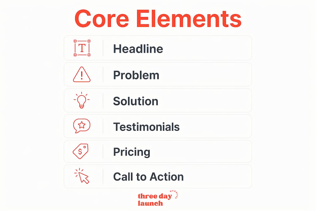
Here are the sections your coaching program landing page must include:
- Transformation headline. Your headline is the first thing visitors read. It must name the outcome your client gets, not what you do. "Double your revenue in 90 days" beats "12-week business coaching program" every time.
- Ideal client description. Tell visitors exactly who this is for and, just as importantly, who it is not for. Reducing buyer uncertainty keeps the wrong people out and builds trust with the right ones.
- Session and module breakdown. Walk through what happens in each phase of the program. Describe the objective of each session, not just the topic. Clients need to see the logical progression from where they are now to where they want to be.
- Outcome and transformation description. Describe the specific result your client achieves. Be concrete. "You'll have a repeatable client acquisition system" is stronger than "you'll feel more confident."
- About you and credibility section. This is not your full bio. It is a focused paragraph that explains why you are the right person to guide this transformation. Include relevant results, credentials, or experience.
- Testimonials near your CTAs. Placing testimonials near pricing can increase conversion rates by up to 34%. Put them above your pricing section, between plan options, and near your final call to action.
- Pricing, checkout, and payment plans. Be transparent about cost. For programs priced above $1,000, offer a payment plan. Charging a slight premium on installment plans is standard practice and acceptable.
Here is a quick reference for how program features map to client benefits:
| Program Feature | Client Benefit |
|---|---|
| Weekly 60-minute calls | Consistent accountability and momentum |
| Private messaging access | Fast answers when you're stuck between sessions |
| Recorded session library | Review content at your own pace |
| Intake and goal-setting process | Clarity on your starting point and destination |
| Community or group access | Peer support and shared wins |
Pro Tip: Write your testimonials section before you write your pricing section. The social proof you place directly above your price anchors the value in the reader's mind before they see the number.
How should you structure your coaching sales page for logical flow?
The six-block coaching offer structure maps directly to your sales page sections. Use it as your content blueprint.
- Problem. Open with the specific pain your ideal client is living right now. Name it clearly. This is where you earn their attention.
- Outcome. State the transformation. What does life look like after working with you? Make it tangible and specific.
- Format. Explain how the program is delivered. Is it live calls, async video, a hybrid model? Clients want to know what they are signing up for.
- Content. Break down the program session by session or module by module. Frame each block as a step in a logical journey, not just a topic on a list.
- Pricing. Present your price clearly with any available payment options. Transparency here builds trust.
- Offer name. Give your program a name that reflects the transformation. "The Revenue Accelerator" communicates more than "6-Week Coaching Package."
Your calls to action need to appear in at least three places: near the top of the page, in the middle after your program breakdown, and at the bottom after pricing. Repeated CTAs and headline testing improve conversion rates because visitors move through pages at different speeds and decision points.
Storytelling is the glue that holds these blocks together. Do not just list what happens in session three. Tell the story of why session three exists and what shifts for the client because of it. That narrative approach is what separates a sales page that converts from one that just informs.

Pro Tip: Repurpose your curriculum modules as marketing content. Each session objective becomes an email subject line, a social post, or a lead magnet topic. Your sales page and your marketing stay consistent because they come from the same source.
Which tools and platforms work best for building your coaching sales page?
The right platform depends on how much you want to manage in one place. Kajabi, Teachable, and Communipass each offer built-in sales page builders alongside program delivery tools. That matters because keeping your checkout, scheduling, and program access in one system reduces the technical friction that kills conversions.
| Platform | Best For | Key Sales Page Feature |
|---|---|---|
| Kajabi | All-in-one coaching businesses | Built-in checkout, email, and page builder |
| Teachable | Course-first coaches | Clean sales page templates with payment plans |
| Communipass | Challenge and cohort programs | Hero section with outcome, price, and duration above the fold |
Communipass's enrollment page template places three conversion elements above the fold: the outcome, the duration, and the price. That upfront clarity reduces bounce rate because visitors immediately know if the offer is relevant to them.
Mobile design is not optional. Each extra form field can reduce mobile conversions by 10–20%. Keep your intake or booking form short. Route visitors to a lightweight scheduling link rather than a long application form unless your program genuinely requires qualification.
A/B testing on your sales page should start with your headline and your primary CTA button. Those two elements have the highest impact on whether someone stays or leaves. Test one element at a time so you know exactly what moved the needle.
Pro Tip: Use a tool like ClickCoach to manage coaching practice operations alongside your sales page. Keeping scheduling, client notes, and payments in one place means less context-switching and more time refining your offer.
What mistakes kill coaching sales page conversions?
The most common mistake coaches make is writing a sales page that reads like a curriculum outline. Features without transformation context do not sell. Visitors need to feel the gap between where they are and where they want to be before they care about your module list.
Watch out for these specific pitfalls:
- Weak or generic headline. Visitors decide in 3–5 seconds if a page is relevant to them. A vague headline like "Work With Me" fails that test immediately.
- Missing audience fit section. If you do not tell visitors who the program is not for, everyone assumes it might not be for them. Specificity builds confidence.
- Testimonials buried at the bottom. Social proof placed near your pricing section addresses buyer anxiety at the exact moment it peaks. Moving testimonials to the bottom wastes their impact.
- One CTA at the top and nothing else. Coaches often place a single button at the top and expect visitors to scroll back up to click it. Repeat your CTA at every logical decision point.
- FAQ section written in coach-speak. FAQ sections written in client-centric language reduce last-minute objections and improve buying confidence. Write answers the way your clients ask questions, not the way you think about your program.
- Testing multiple elements at once. Split-testing one element at a time prevents muddled insights. Change your headline, measure the result, then move to your CTA.
The seven-section sales page structure used by high-converting course pages includes a headline, problem, solution with module breakdown, social proof, objection-handling FAQ, pricing with CTA, and a final urgency CTA. If your page is missing any of these, that is where your conversions are leaking.
Good website copy for coaches follows the same principle: lead with the client's reality, not your credentials. Your about section earns its place after you have already made the visitor feel understood.
Let's Launch Your Strategic Coaching Website
Your first step is to book a free call so we can get your questions answered.
Book A Free CallPro Tip: Read your FAQ section out loud. If it sounds like a legal document, rewrite it. Your FAQ should sound like you answering a question from a real client over coffee.
Key Takeaways
A coaching program sales page converts when it leads with transformation, structures content around the client's journey, and places trust signals at every decision point.
| Point | Details |
|---|---|
| Lead with transformation | Your headline must name the outcome, not the program format or session count. |
| Use the six-block structure | Problem, outcome, format, content, pricing, and offer name create logical page flow. |
| Place testimonials near pricing | Social proof placed above your price reduces buyer anxiety at the moment it matters most. |
| Test headline and CTA first | These two elements drive the most conversion lift before you refine anything else. |
| Keep forms short on mobile | Reducing form fields protects mobile conversions, which drop significantly with each extra field. |
What I've learned building sales pages for coaches
Here is the uncomfortable truth about most coaching sales pages: they are written for the coach, not the client. I see it constantly. The page opens with the coach's story, lists their certifications, and then describes the program in terms the coach uses internally. The client lands on the page and thinks, "This sounds impressive, but is it for me?"
The shift that changes everything is writing the first half of your page entirely from the client's perspective. Name their problem in their words. Describe their current situation with enough specificity that they think you have been reading their journal. Only after you have done that do you introduce yourself and your program.
The six-block structure works because it mirrors how a buyer actually thinks. They are not asking "what modules does this have?" They are asking "will this fix my problem, and can I trust this person?" Your page needs to answer those questions in that order.
We have also seen coaches dramatically improve conversions simply by moving their testimonials. One coach had three strong client wins buried in a scrollable section at the very bottom of the page. Moving two of them directly above the pricing section produced a noticeable lift in enrollment inquiries within weeks. No copy changes. No redesign. Just placement.
The other thing worth saying plainly: your sales page is never finished. The coaches who get the best results treat it as a living document. They test a headline, measure it for two weeks, and adjust. They add a new testimonial every time a client gets a strong result. They refine the FAQ every time a prospective client asks a question on a discovery call. That ongoing attention is what separates a page that converts consistently from one that converts occasionally.
If you want your coaching website to build trust from the first visit, your sales page is where that trust either gets established or lost.
— Three Day Launch
Your coaching sales page, built in three days
Getting a professional sales page live does not have to take months or cost a fortune. Three Day Launch builds fully custom, multi-page coaching websites in just three days, designed specifically to attract leads and convert clients.
Coaches in life, finance, and health have used Three Day Launch to go from no online presence to a conversion-ready website fast. If you are ready to stop wrestling with templates and start showing up online with a site that actually works, a custom coaching website built for your offer is the fastest path there. See what Three Day Launch can do for your coaching business at threedaylaunch.com.
FAQ
What is a coaching program sales page?
A coaching program sales page is a long-form web page designed to convert visitors into paying clients by communicating your program's transformation, structure, and value. It functions as the central enrollment hub for your coaching offer.
How long should a coaching sales page be?
Length should match the complexity and price of your offer. Higher-priced programs above $1,000 typically need more detail, including session breakdowns, testimonials, and payment plan options, to justify the investment.
Where should I place testimonials on my coaching sales page?
Place testimonials directly above your pricing section, between payment plan options, and near your final CTA. Testimonial placement near CTAs can increase conversions by up to 34%.
What is the best platform to build a coaching sales page?
Kajabi, Teachable, and Communipass each offer built-in sales page tools with checkout and program delivery in one place. The best choice depends on whether you prioritize email marketing, course delivery, or cohort-based programs.
How do I know if my coaching sales page is working?
Start by A/B testing your headline and primary CTA button. Visitors decide in 3–5 seconds if a page is relevant, so those two elements have the highest impact on whether someone stays and converts.